Logo
Solvexia logo is a core element of our brand identity, providing a visual representation of our company. It fosters brand recognition and recall, ensuring people can remember and quickly recognise us.
Logo
The Solvexia logo can be presented in three different ways: logomark, logotype and lockup. Each representation is subject to the context where it's being used.
Logomark
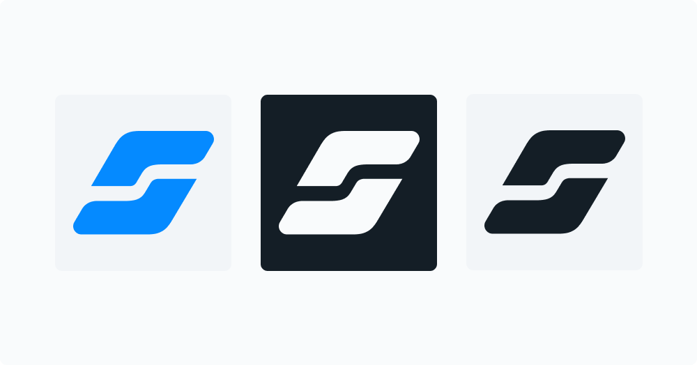
Solvexia logomark is used in a variety of contexts and surfaces, including product, events, marketing material and other touchpoints. The logomark is the primary way to emphasise the visual concept of Solvexia brand.
Logomark can be used in small spaces like social media, icons, etc.
Logotype
Solvexia logotype is used in situations when our brand may not be recognised by our logomark. The logotype ensures people remember our name. Solvexia is always one word and should be used to refer to our company, product, or service.
Lockup
Lockup is the primary type of logo that is used in most of contexts, including official documents, product, events, marketing material and other touchpoints.
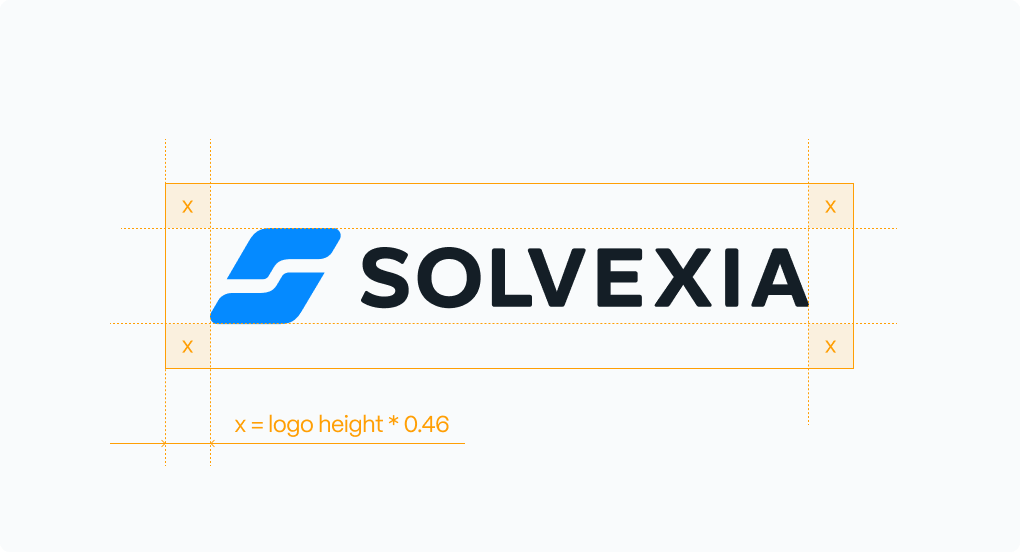
When using the logo in any context, consider spacing based on the height of the logo.
Solvexia sub-branding
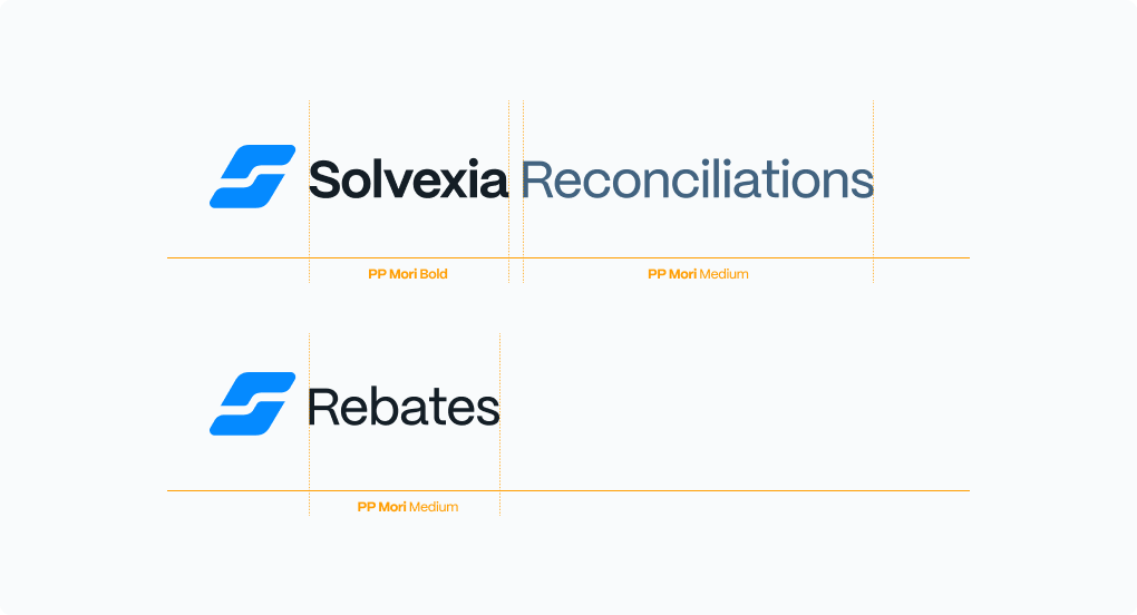
Solvexia individual products or features at times require a custom sub-brand logo. The sub-brands use standard lockup of a logomark and a logotype created with our brand font, PP Mori.
Simple formulae can be used to create the visual language for a sub-brand lockup:
logomark + solvexia name + sub-brand
or
logomark + sub-brand
Solvexia co-branding
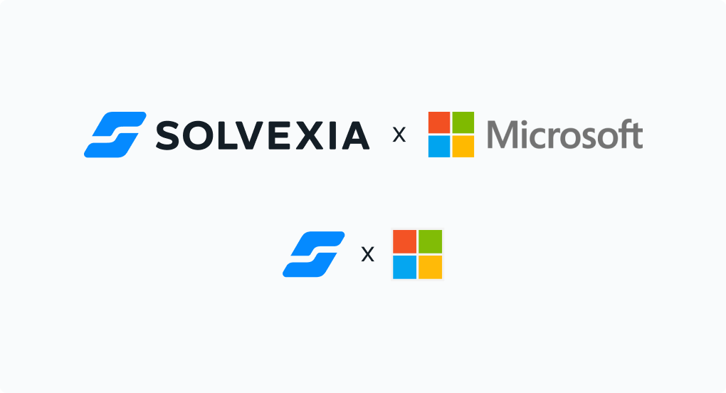
In cases when there is a need to highlight Solvexia official partnerships with other companies or clients, the following hierarchy should be followed to represent the two brands together.
Using logo
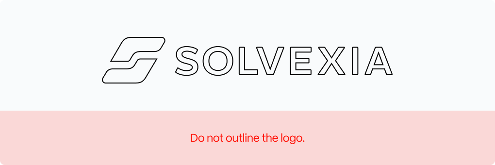
Common misuse
Please avoid the following common mistakes when handling the logo.
