Colours
Colours of Solvexia brand represent it's core nature and allow us to communicate and express stories through Solvexia personality. Our colour base consists of two palettes–primary and secondary.
Primary colours
The main colours feature neutral tones of black and white complemented by a single primary blue accent colour. This combination adds a sense of seriousness and focus, all while emphasising the one feeling we aim to convey: a sense of completion.
BLACK
HEX: #141E26
WHITE
HEX: #F9FBFC
BLUE
HEX: #058AFF
Secondary colours
The supplementary colours are crafted to infuse the brand with expression and personality, adapting to the message we wish to convey or the story we aim to tell. Each colour evokes a unique emotion, while combinations of two colours can be used to create palettes and address broader themes, such as security, support, and more.
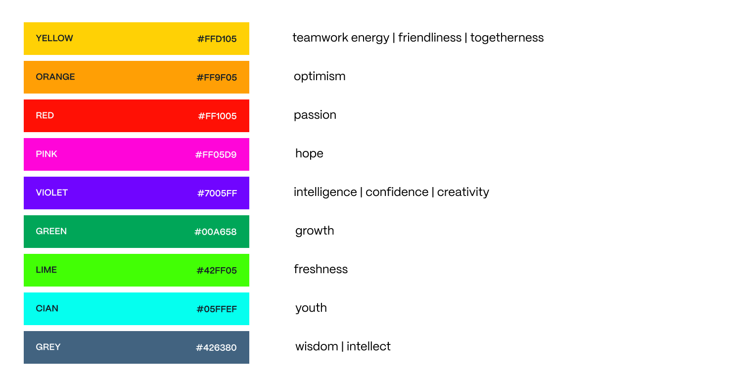
YELLOW
HEX: #FFD105
ORANGE
HEX: #FF9F05
RED
HEX: #FF1005
PINK
HEX: #FF05D9
VIOLET
HEX: #7005FF
GREEN
HEX: #00A658
LIME
HEX: #42FF05
CIAN
HEX: #05FFEF
GREY
HEX: #426380
Colour roles
Colour's meaning changes based on context, requiring a nuanced approach in design. In UI design, colours serve functional roles, focusing on clarity and accessibility. In brand collateral, colours evoke emotions and convey brand personality, prioritizing aesthetics and brand alignment. Consider these contextual differences to use color effectively.
Brand collateral
To evoke emotions and convey brand personality the colours are assigned the following meanings.
User interface
Consider the following functional roles of colours when creating user facing interfaces. Cohesiveness will improve clarity, accessibility, and overall user experience with the product.
User interface must stay within the black/white colour schema with other colours being used for accents and highlights.
| Colour | Role | Description |
|---|---|---|
| brand, information, neutral | Use this as a default colour for text, buttons or other general UI components. | |
| accent:brand | Use for principal actions or components that communicate the Solvexia brand. Use for informative UI components for extra emphasis. | |
| accent:success | Use for UI components that communicate successful state or outcome. | |
| accent:danger | Use for UI components that represent danger or serious error states. | |
| accent:warning | Use for UI components that represent caution or attract extra attention to prevent mistakes. | |
| accent:discovery | Use for UI components that represent new state of something, introduction or finding. | |
| accent:waiting | Use for UI components that communicate waiting state for the user or action. |
Scales
We have developed a scale for each color to allow for different color variations while maintaining cohesiveness throughout the visual brand communication language.
Colour combinations
Gradients
Combinations of colours in a gradient can be used to convey a broader area or theme of communication, such as security, support and more.
Support

background: linear-gradient(89.71deg, #FFED9B 11.63%, #FFD99B 43.7%, #FF9BF0 73.71%, #426380 103.71%);
Intelligence (AI)

background: linear-gradient(89.71deg, #7006FF 11.63%, #426380 43.7%, #03FFEF 73.71%, #68FF37 103.71%);
Security

background: linear-gradient(89.71deg, #058AFF 11.63%, #28B875 43.7%, #426380 73.71%, #7005FF 103.71%);
Accessibility
Color contrast between text and its background must meet WCAG standards. To ensure the correct use of background and foreground colours you can use an online contrast checker.