Illustrations
Solvexia's illustration style is a distinctive visual language that captures our unique position at the intersection of the world of finance and the systems we build to understand it.
Our illustrations use surreal digital collage to tell a story about what we do: bringing clarity to complexity, enabling the journey through financial landscapes, and helping people arrive where the meaningful work begins.
The visual metaphor
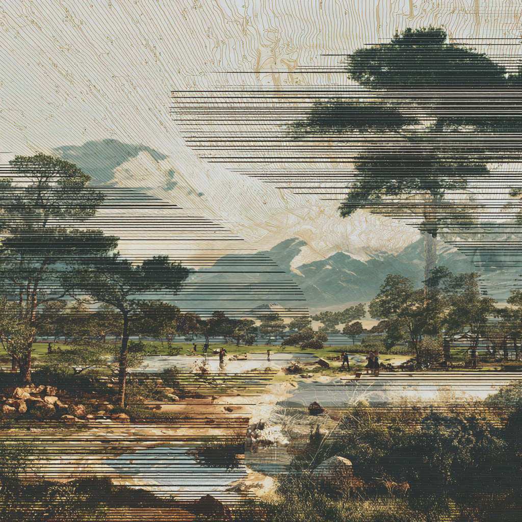
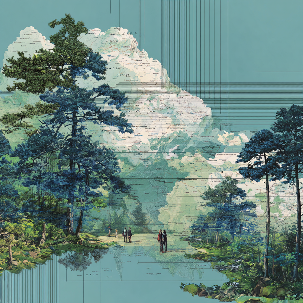
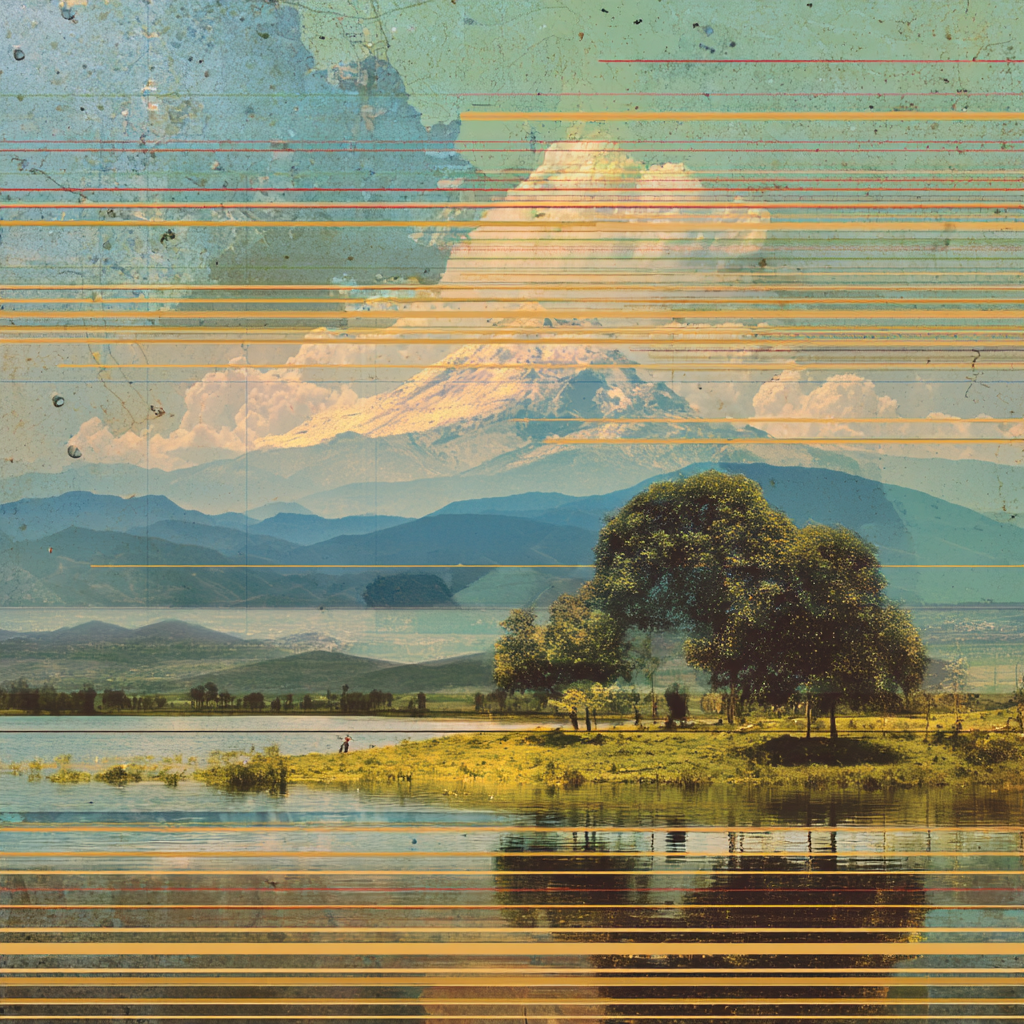
At the heart of our illustration style lies a central metaphor: the relationship between the territory and the map.
Nature as reality
The natural landscapes in our illustrations—rolling hills, dramatic cloudscapes, serene waters—represent the reality of money and business. Finance, at its core, is organic. Cash flows like rivers. Markets rise and fall like terrain. Transactions bloom and multiply like ecosystems. This is the living, breathing world of real financial activity.
Maps as understanding
Overlaid on these natural scenes are cartographic elements—contour lines, grid references, the familiar visual language of mapping. This represents our human attempt to understand, organise, and navigate financial reality. Just as a map helps us traverse unfamiliar terrain, financial systems help us make sense of complex data.
The overlay of map on landscape captures what Solvexia does: we help organisations align their understanding of their finances (the map) with the actual state of their money (the territory). Reconciliation, at its essence, is ensuring these two views match.
Core visual elements
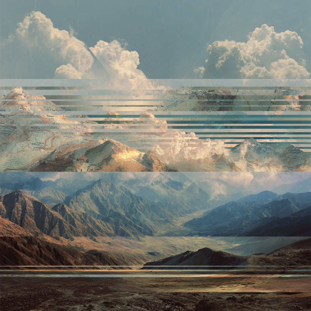
Horizontal lines
Recurring horizontal lines traverse our illustrations, sometimes subtly disrupting the image, other times integrating seamlessly into the composition. These lines serve multiple symbolic purposes:
Rows and transactions. The horizontal lines evoke spreadsheet rows, database tables, and transaction ledgers—the fundamental structure of financial data. They remind us that behind every beautiful landscape of natural commerce lies organised, structured information.
Movement and flow. Horizontal lines suggest motion and direction. Money moves. Data flows. Processes run from left to right, input to output. The lines capture this constant forward momentum.
Digital intervention. The slight glitch-like quality of the lines acknowledges the digital nature of modern finance. They are deliberate imperfections that signal the presence of technology mediating between raw reality and human understanding.
The collage technique
Our illustrations are constructed as collages—layered compositions where different elements coexist in the same space without fully merging. This technique is intentional:
Multiple data sources. Finance professionals work with data from countless sources: banks, payment gateways, ERP systems, spreadsheets. A collage visually represents this multiplicity—different pieces that must be brought together into a coherent whole.
Reconciliation visualised. The act of creating a collage mirrors the act of reconciliation itself. Disparate elements are aligned, compared, and unified. The slight tension between collage layers reflects the real-world challenge of making different data sets agree.
Transformation. Collage transforms its source materials into something new. Similarly, Solvexia transforms raw data into insights, manual processes into automated workflows, complexity into clarity.
The colour palette
Our illustrations draw from a warm, naturalistic colour palette inspired by Studio Ghibli films. This choice is deliberate:
The journey matters. Think of a hike: you take a train or drive to reach the trailhead, then continue on foot. The train isn't separate from the journey—it's part of it. Automation is our train. It carries people through the tedious terrain so they can arrive where the rewarding work begins. Our palette captures the feeling of being on that journey—the anticipation, the unfolding landscape, the satisfaction of moving forward.
Approachability. The nostalgic, almost painterly quality of our palette makes complex financial concepts feel more approachable. It invites viewers in rather than creating distance.
Craftsmanship. Ghibli films are renowned for their meticulous attention to detail and care. This association reinforces Solvexia's own commitment to precision and quality in everything we build.
Presence over destination. There is beauty in the process itself, not just the outcome. Our palette evokes the feeling of being present in the work—the calm focus of a well-designed system running, the quiet satisfaction of data aligning. The destination matters, but so does every step along the way.
Creating illustrations
When creating illustrations for Solvexia, keep these principles in mind:
Composition balance
Balance the organic (landscape, clouds, vegetation) with the systematic (lines, grids, map elements). Neither should completely dominate—the tension between them is the point.
Emotional resonance
Aim for compositions that evoke wonder, satisfaction, and calm confidence. Avoid imagery that feels chaotic, aggressive, or cold. The viewer should feel that complexity is being resolved, not created.
Usage
Illustrations are used primarily in brand collateral, marketing materials, and communications where we want to establish emotional connection and communicate our values visually. They are not typically used within the product interface itself, where clarity and functionality take precedence.
Appropriate contexts include:
- Website hero sections and landing pages
- Presentation decks and pitch materials
- Social media and advertising
- Event materials and banners
- Thought leadership content and reports